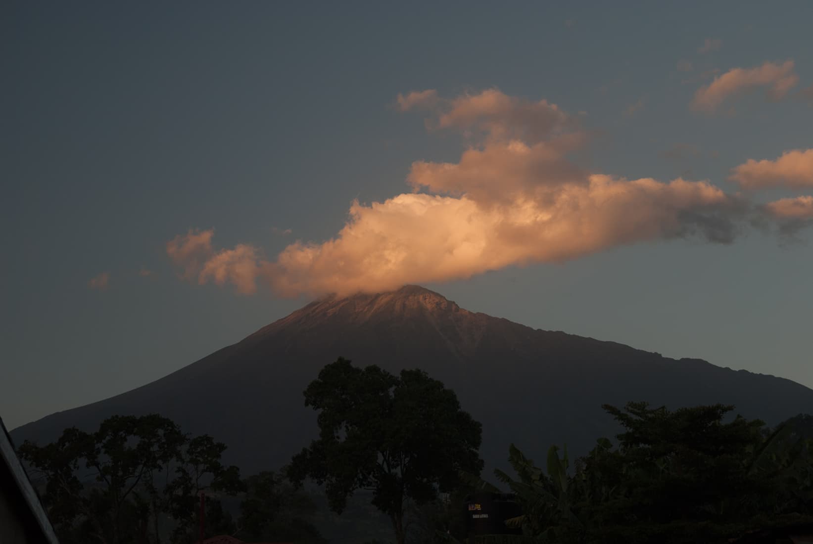
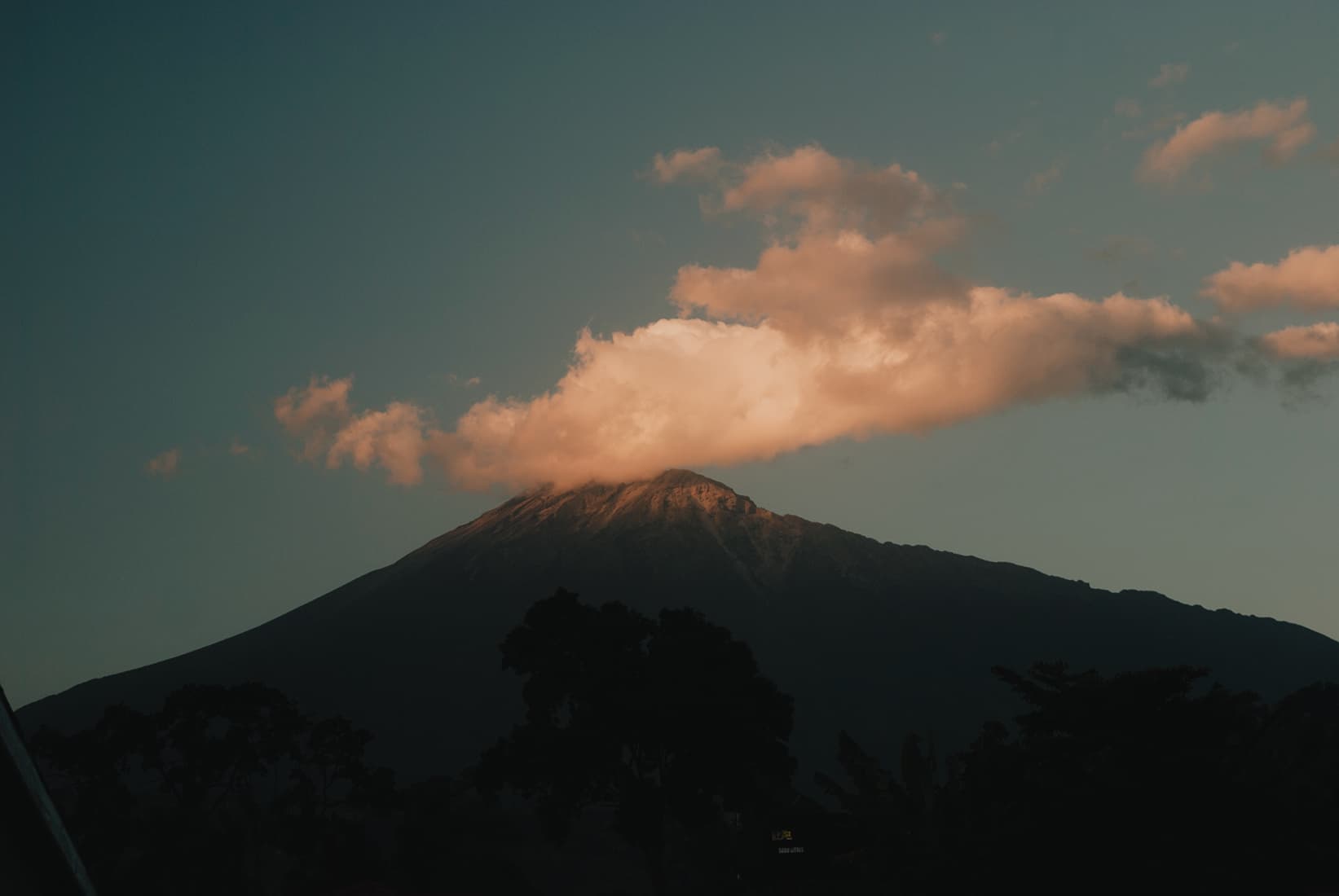
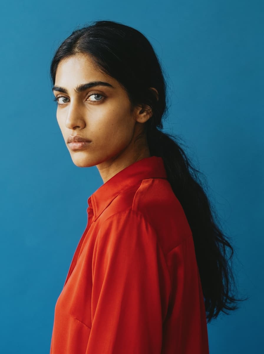
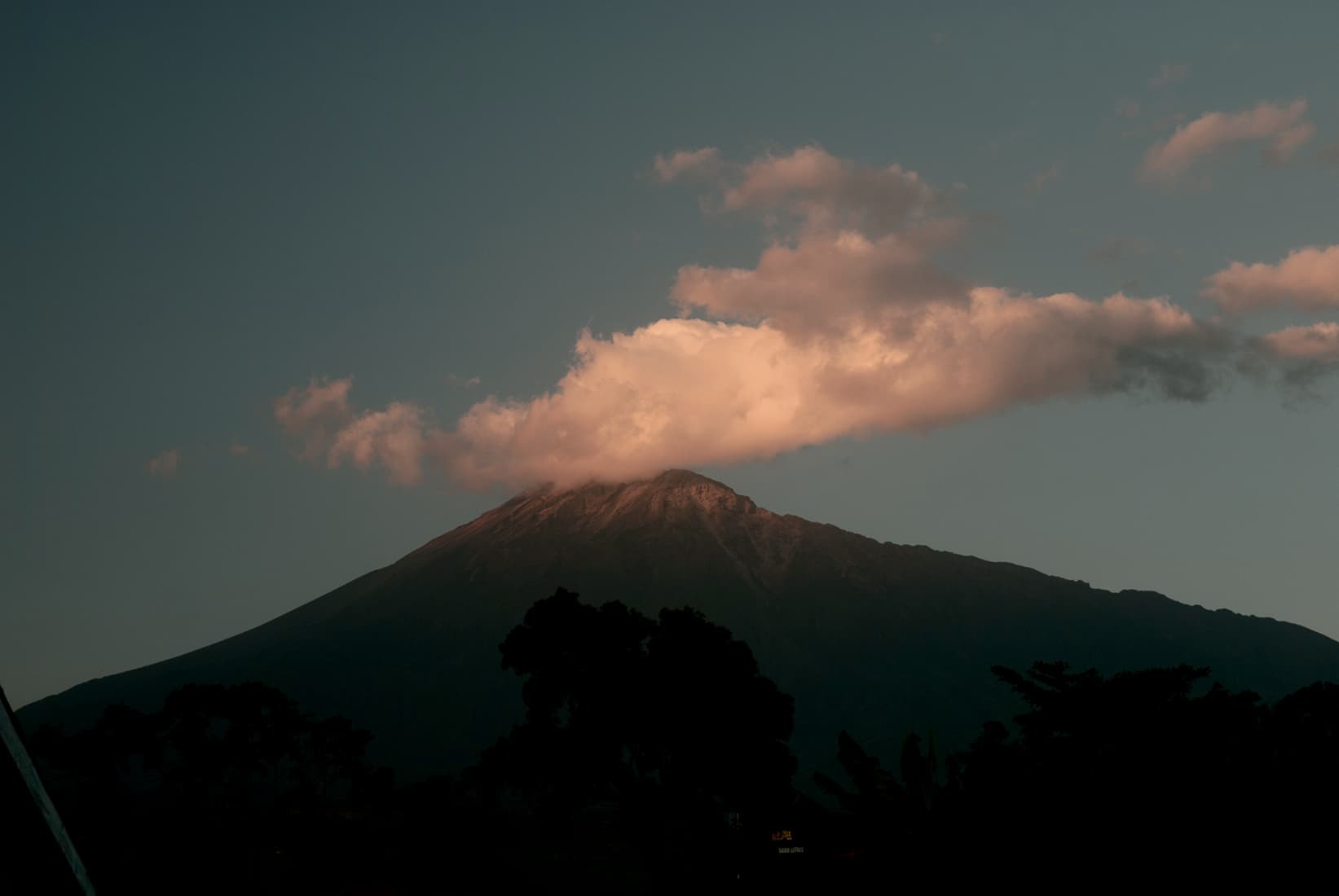
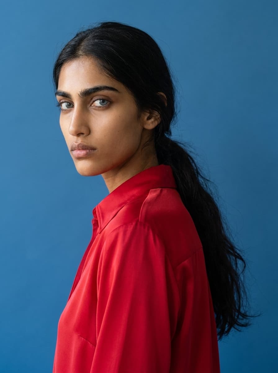
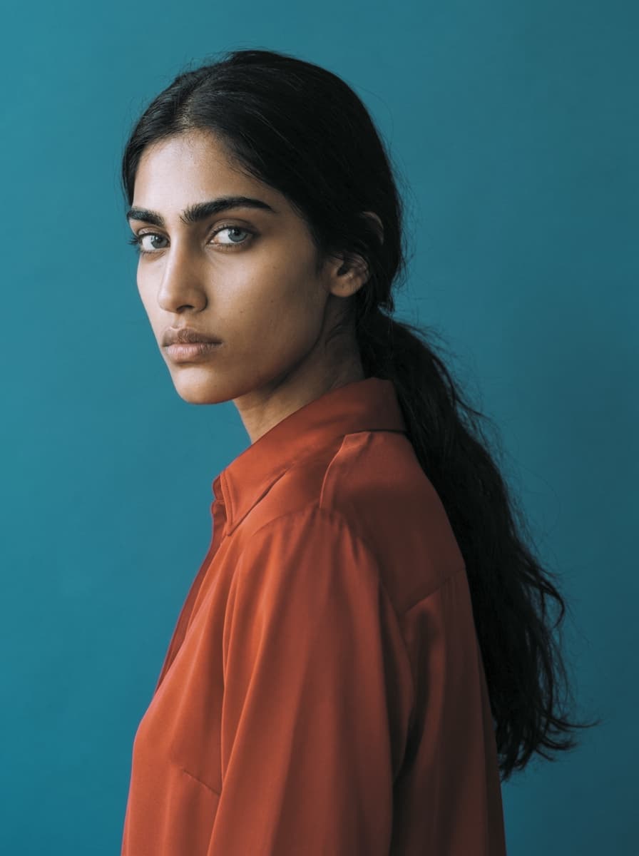
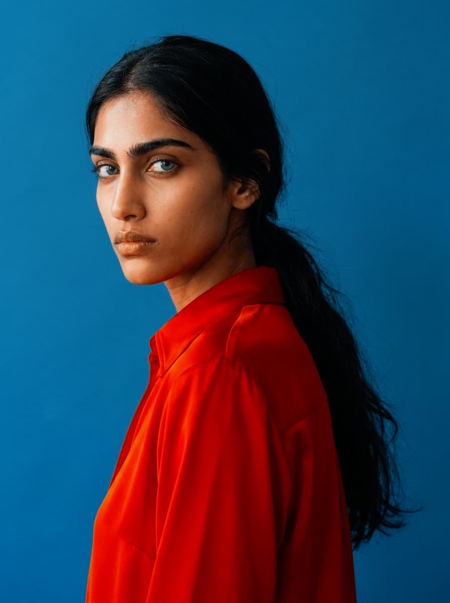
Original
Ungraded reference portrait — no LUT applied.
Stack scanned film grain, halation and LUT to get the Film look. Tune each one live, save the combination as a preset.
Explore the collection of adjustable effects for maximum control.
Organic stock texture for photos and videos, from subtle emulsion to gritty scans.
open film grain →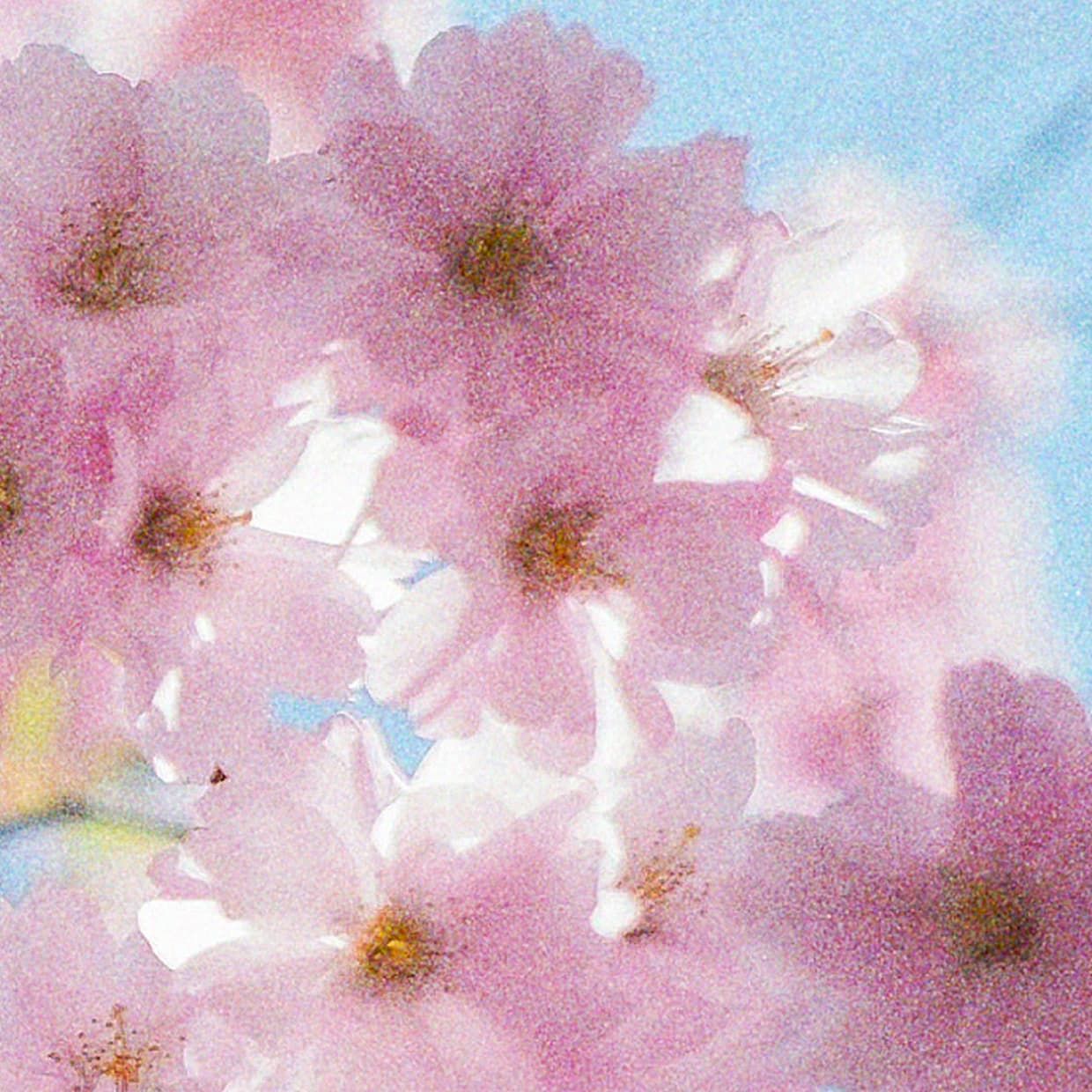
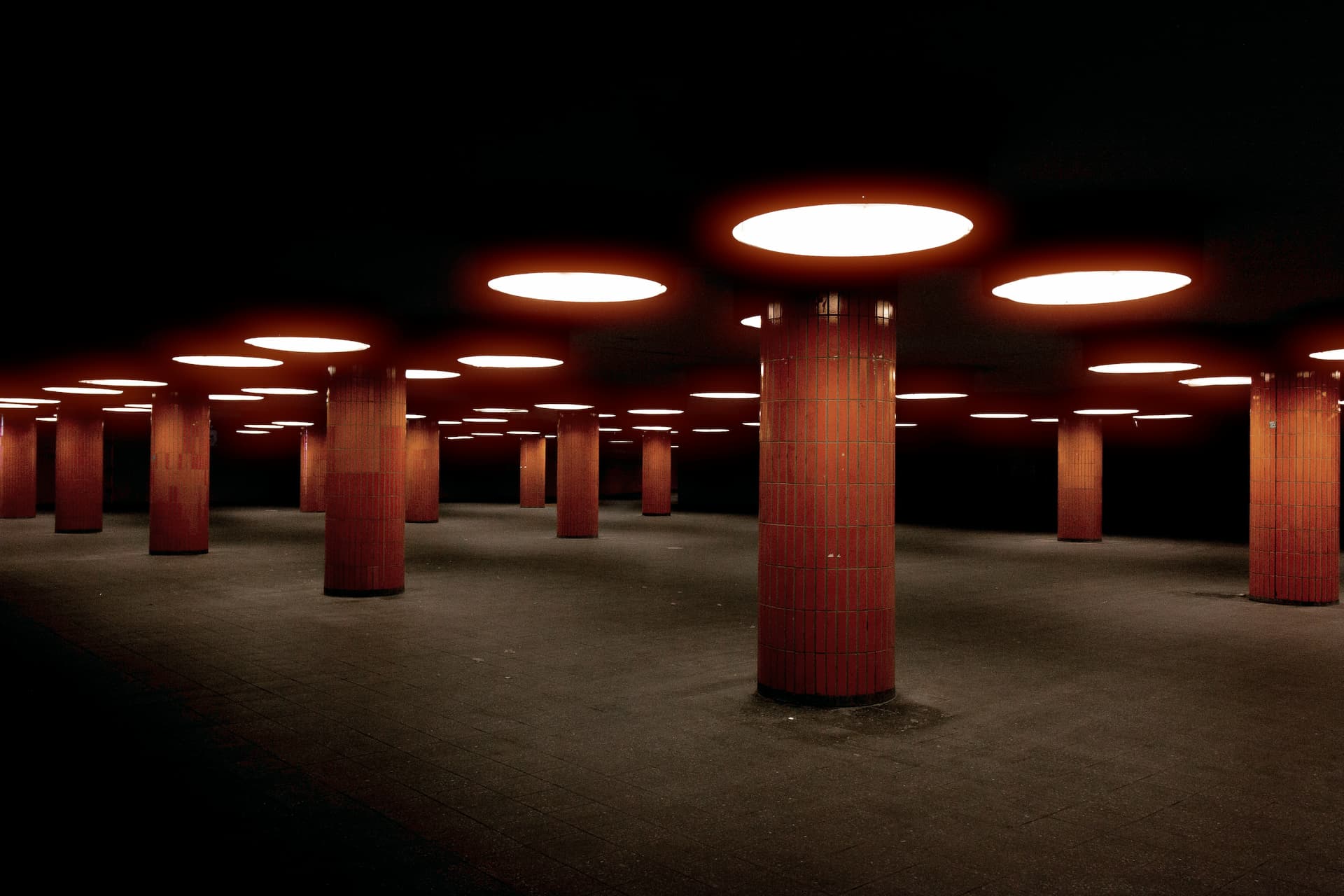
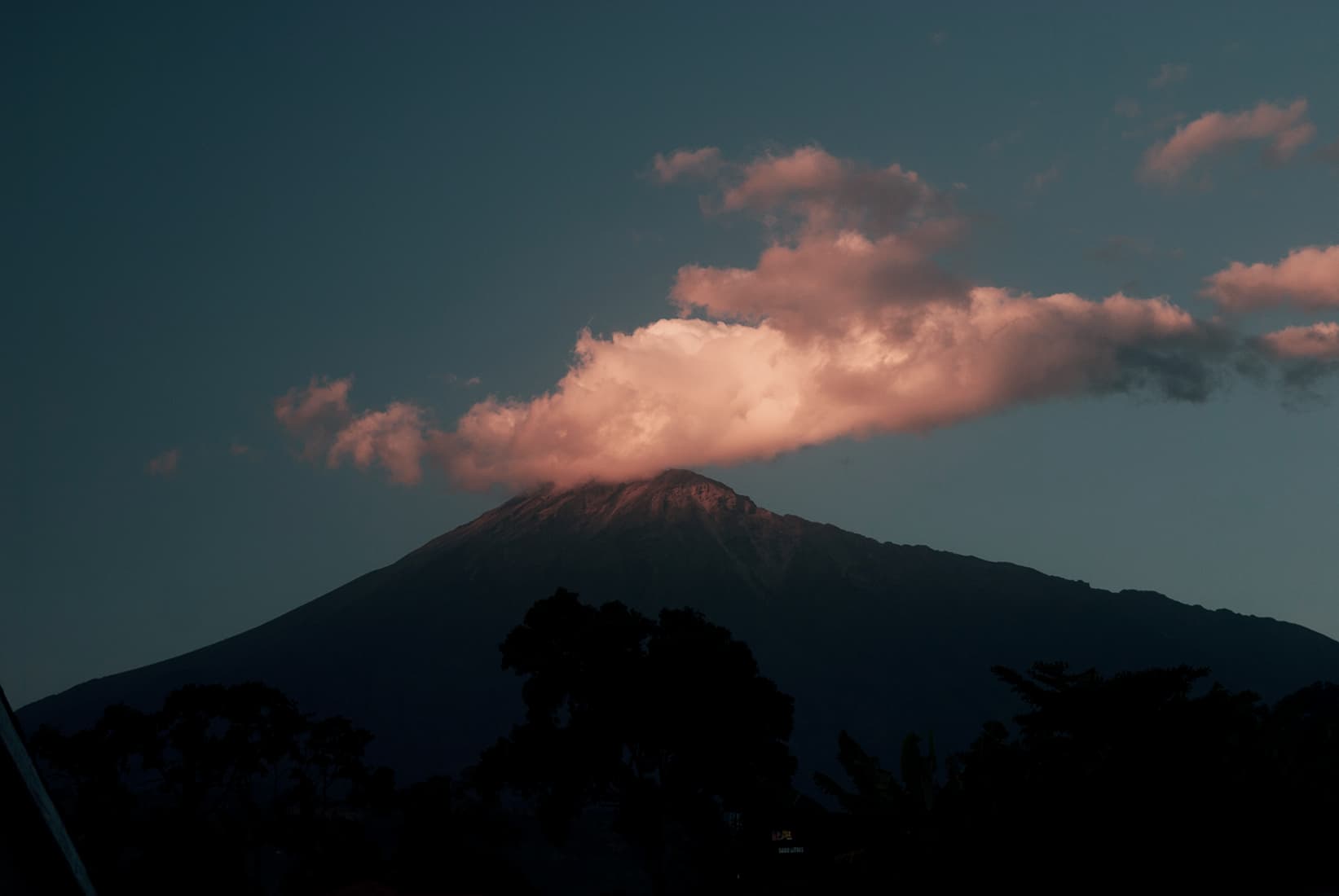
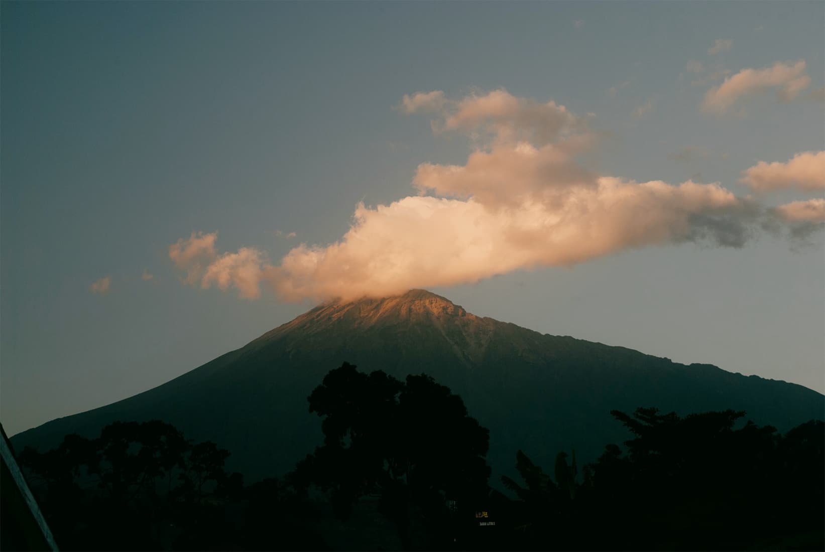
Warm red-orange glow around highlights, neon, backlight, and bright reflections.
open halation →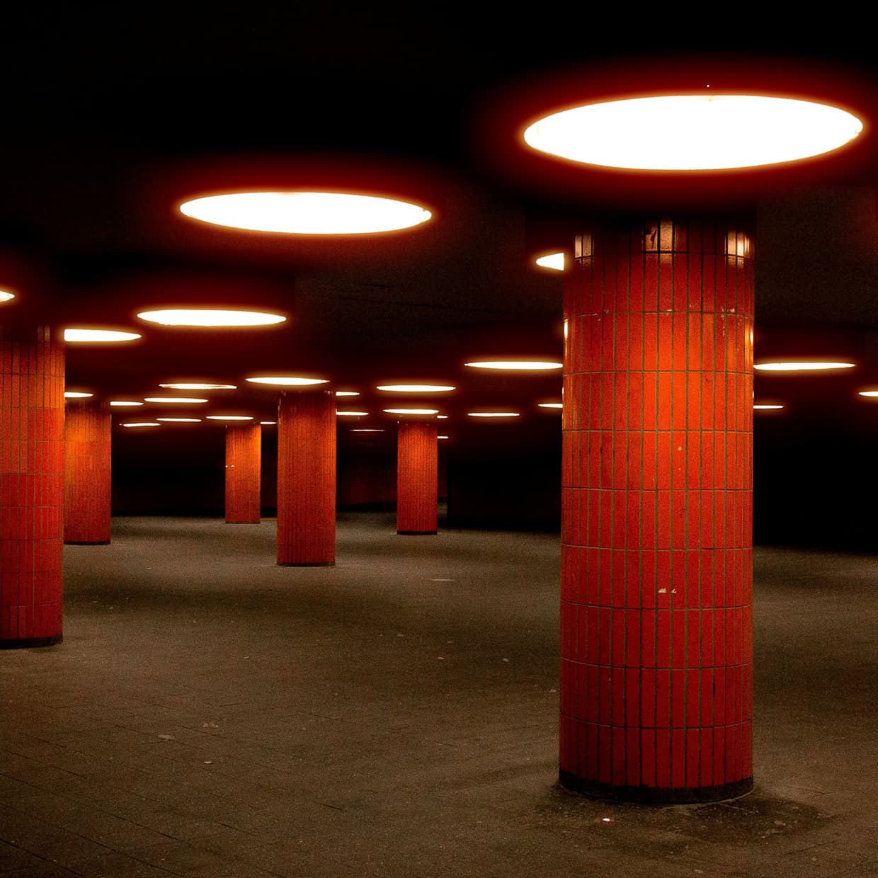
True-to-life color from Kodak Portra, Ektar, Gold, and Fuji film stocks.
open classic film →
Classic film color grades inspired by analog stocks, scans, and old print looks.
open vintage film →
Monochrome film tone with clean contrast for portraits, street shots, and stills.
open black & white →
Darken edges and shape the frame with a soft, adjustable falloff for a classic photo finish.
open vignette →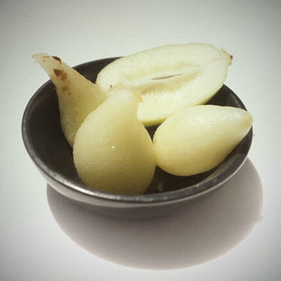
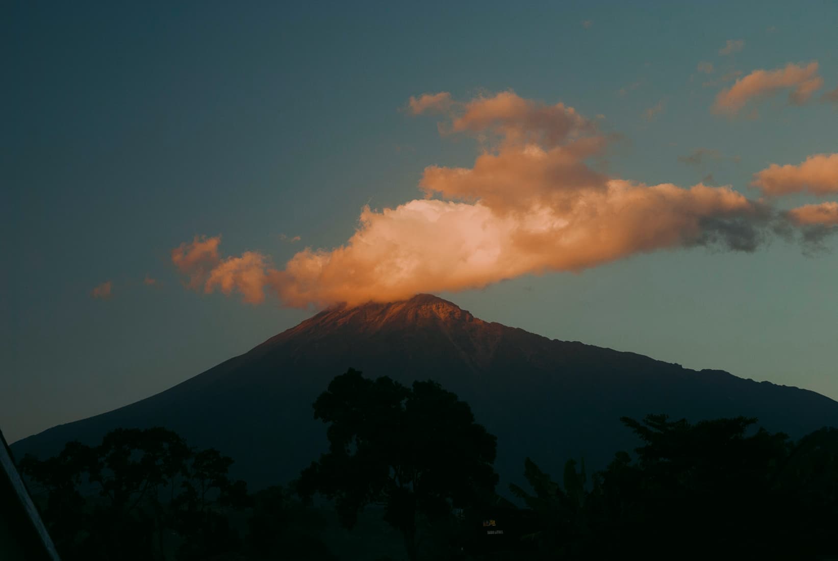
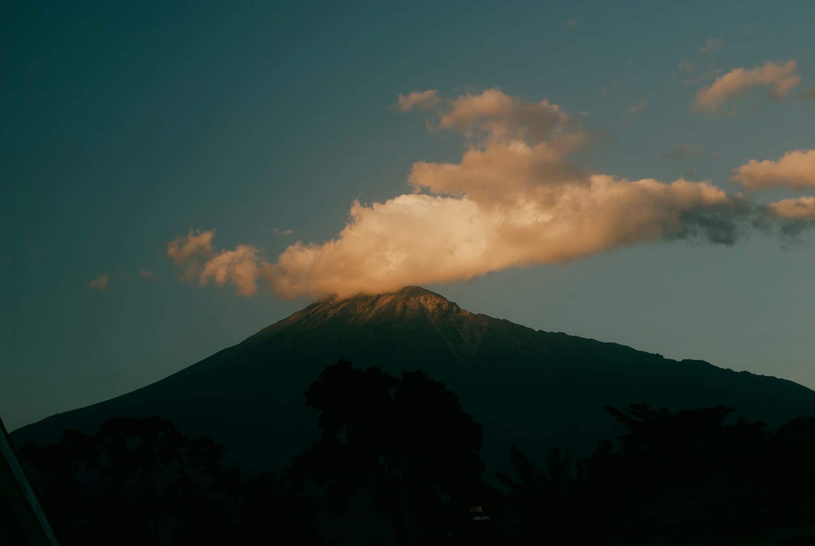
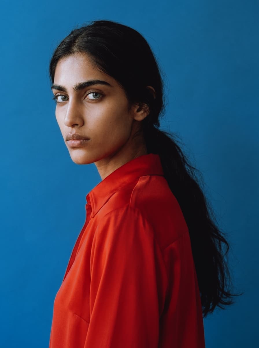
Combine halation, film grain and vintage color grades.
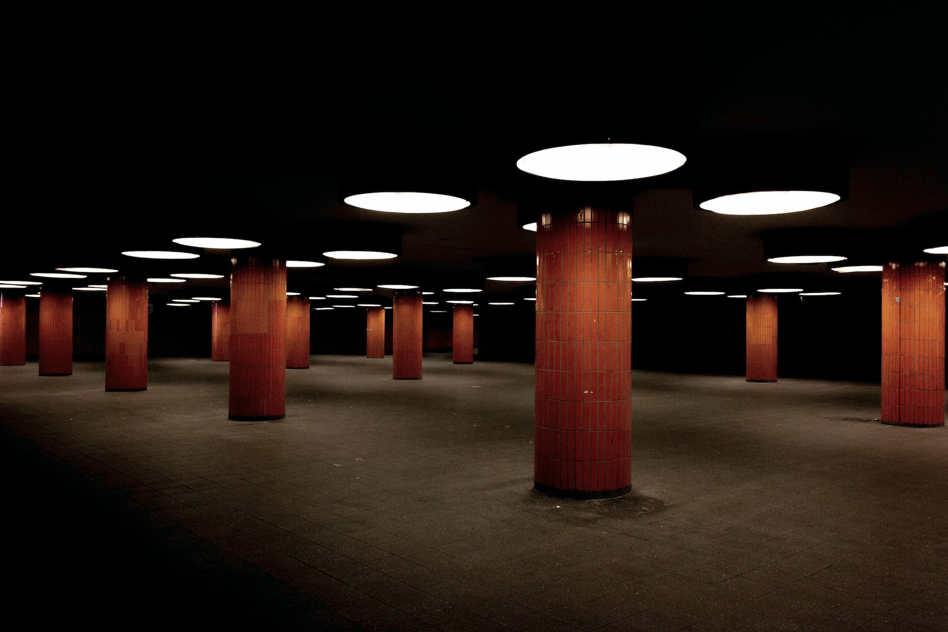
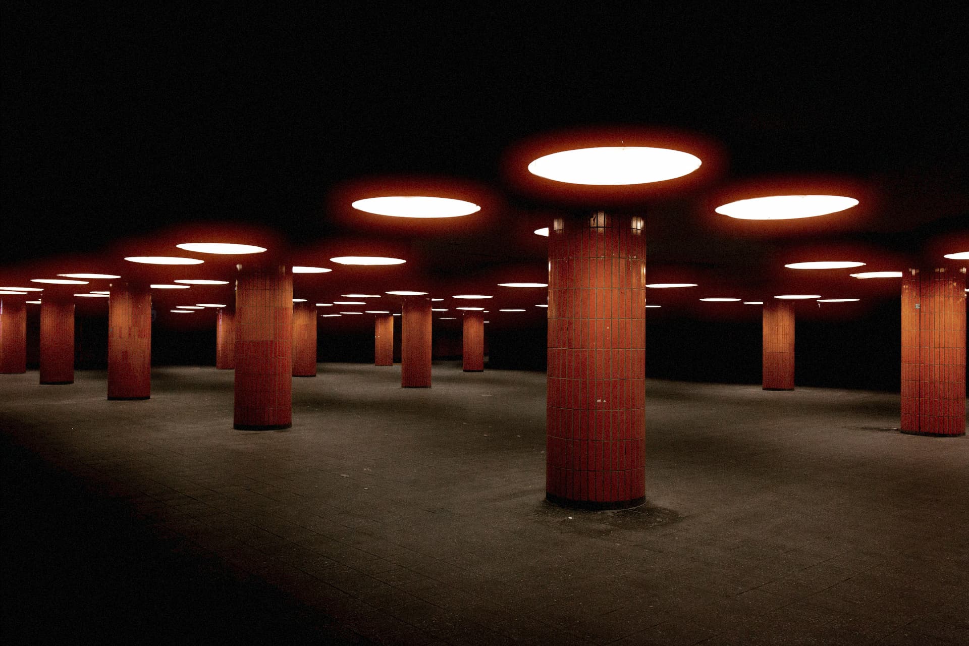
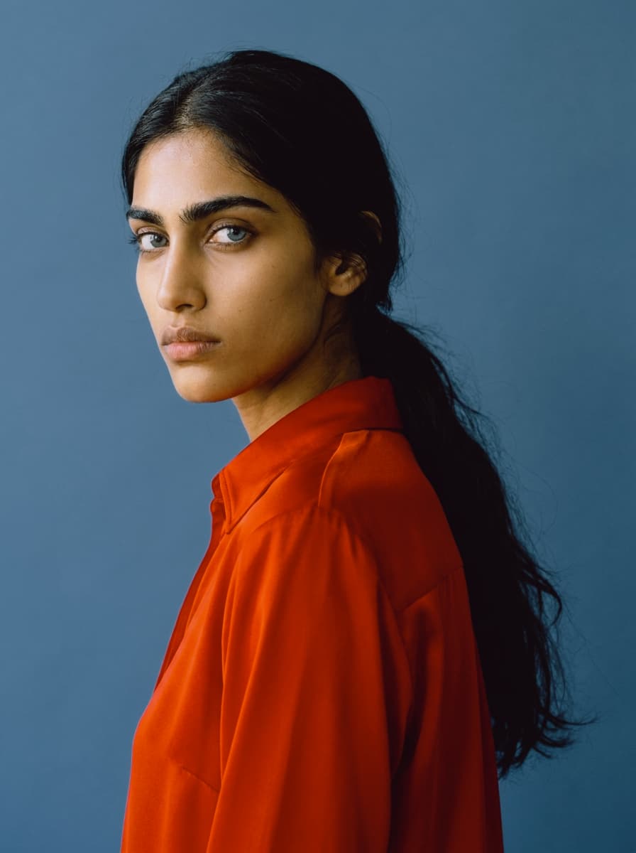
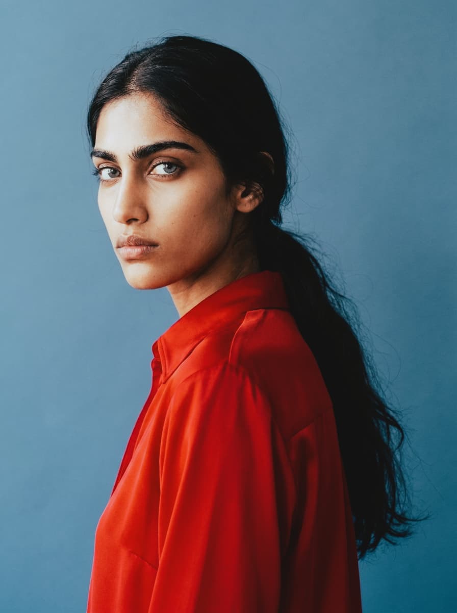
Original
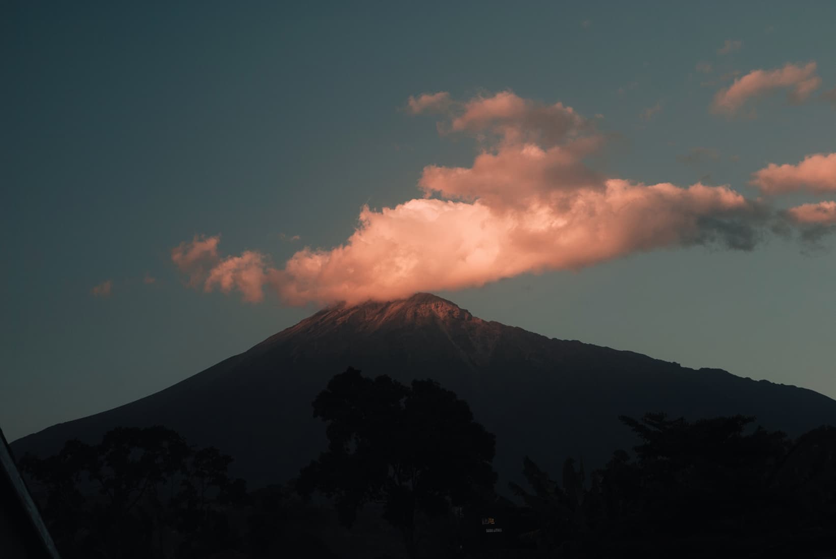
 Halation
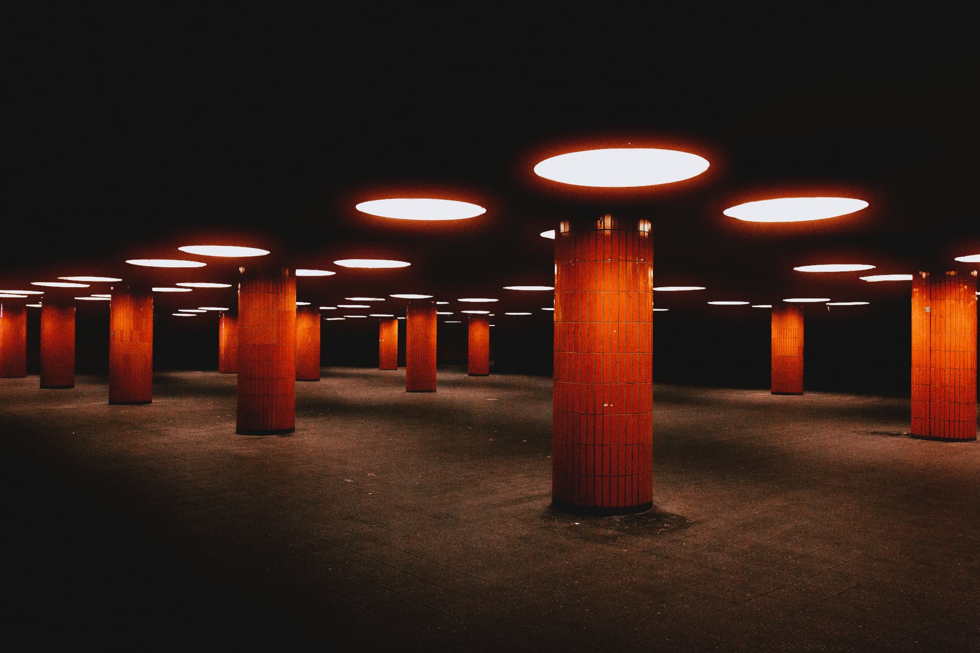
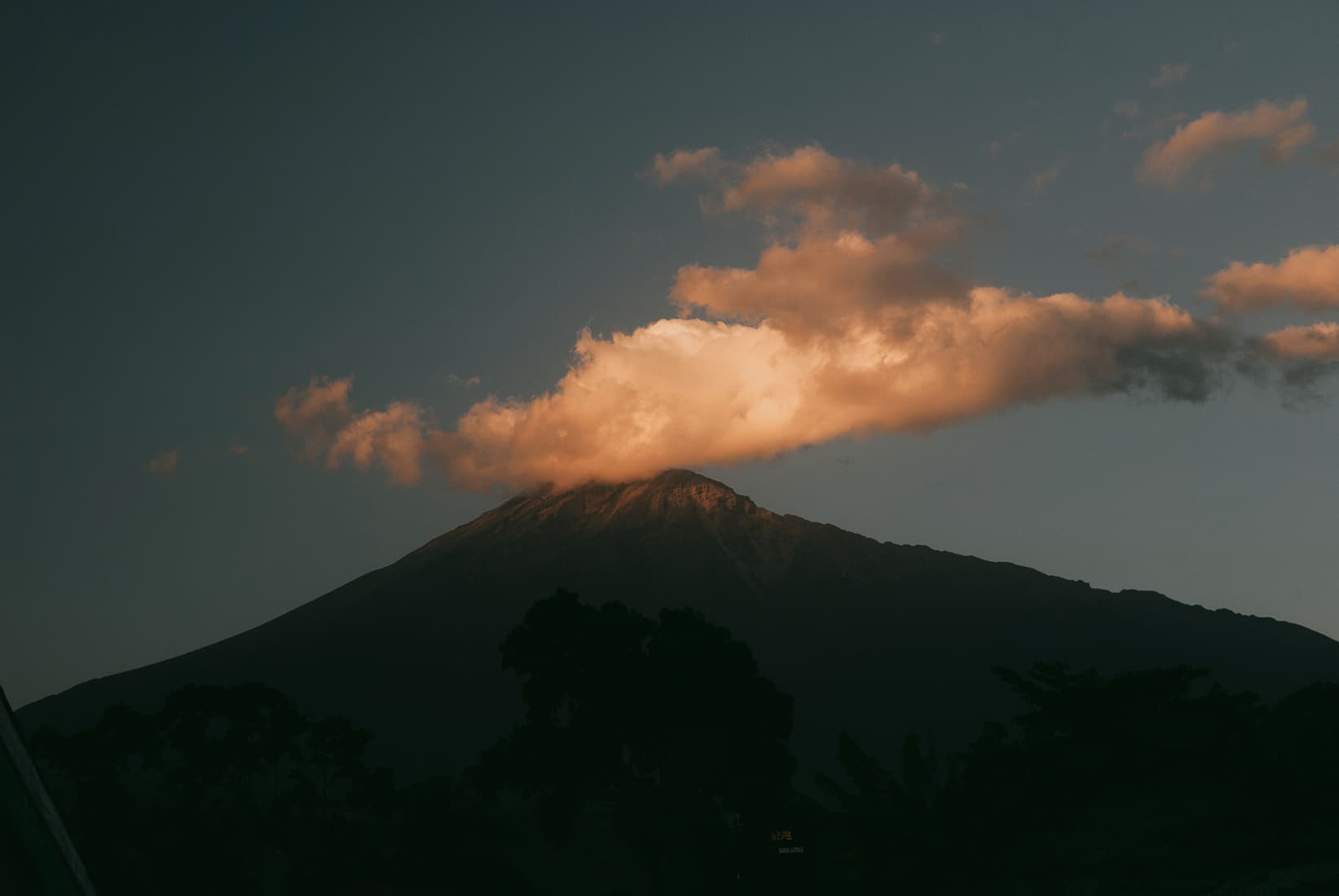
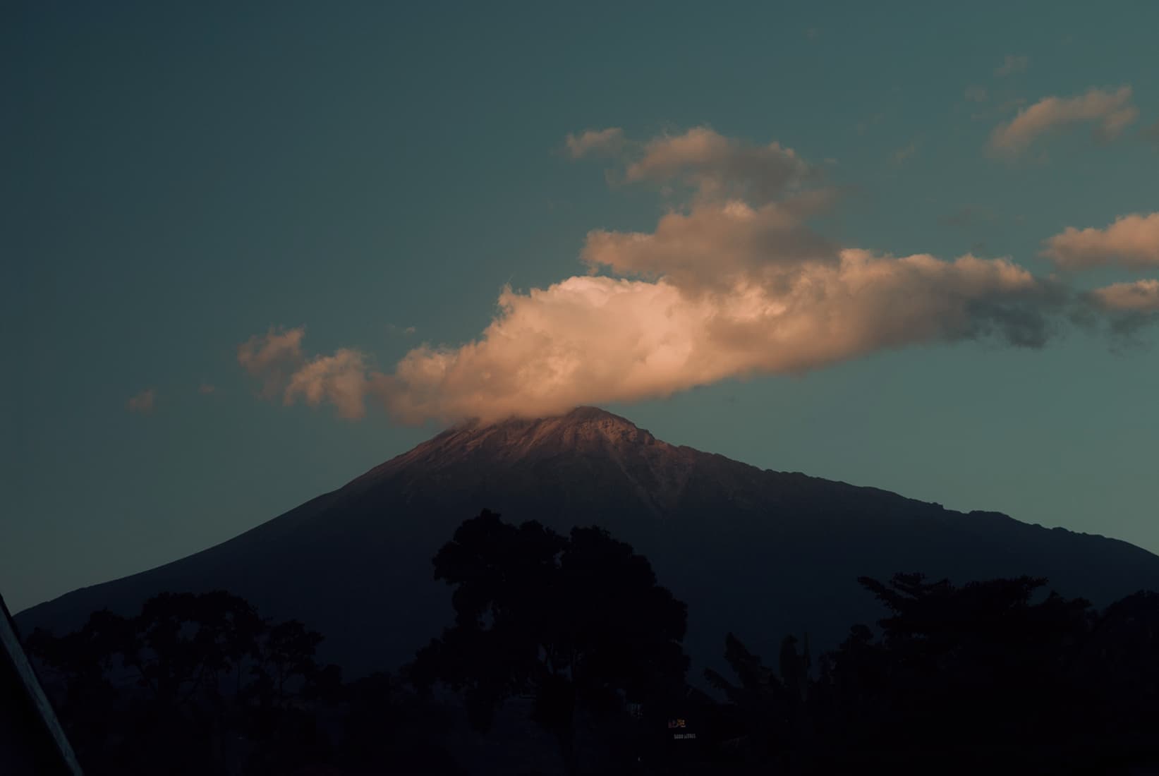
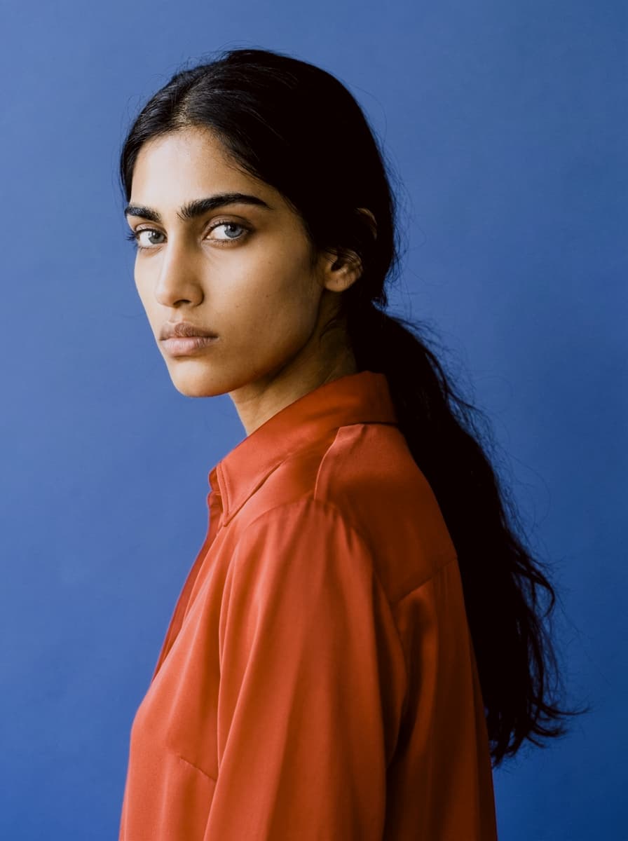
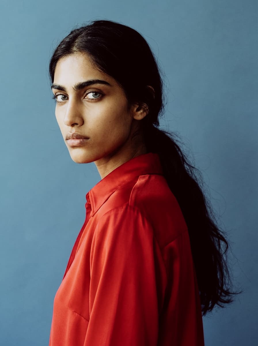
 Film Grain
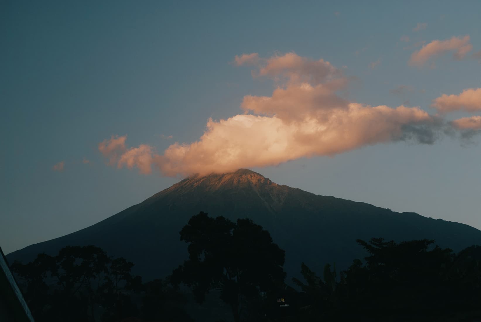
Color grade
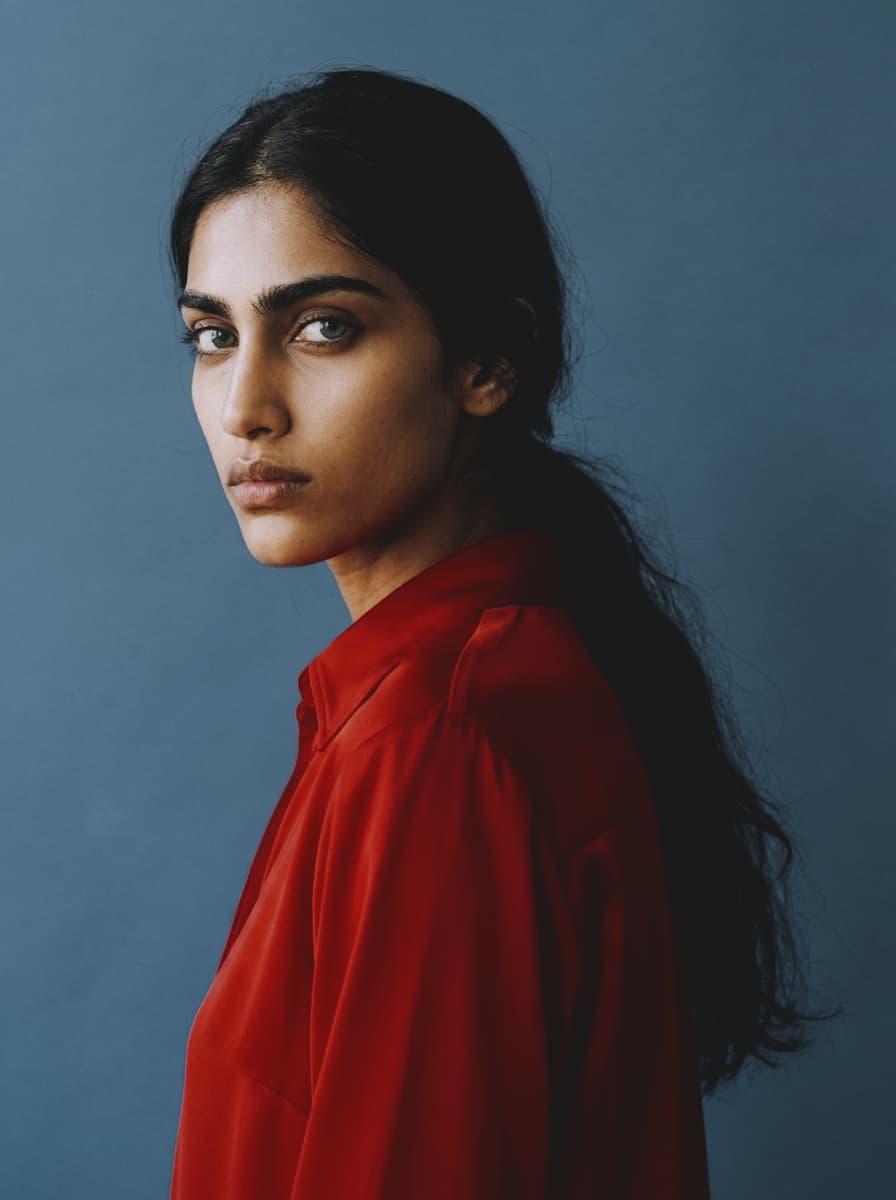
Film Grain
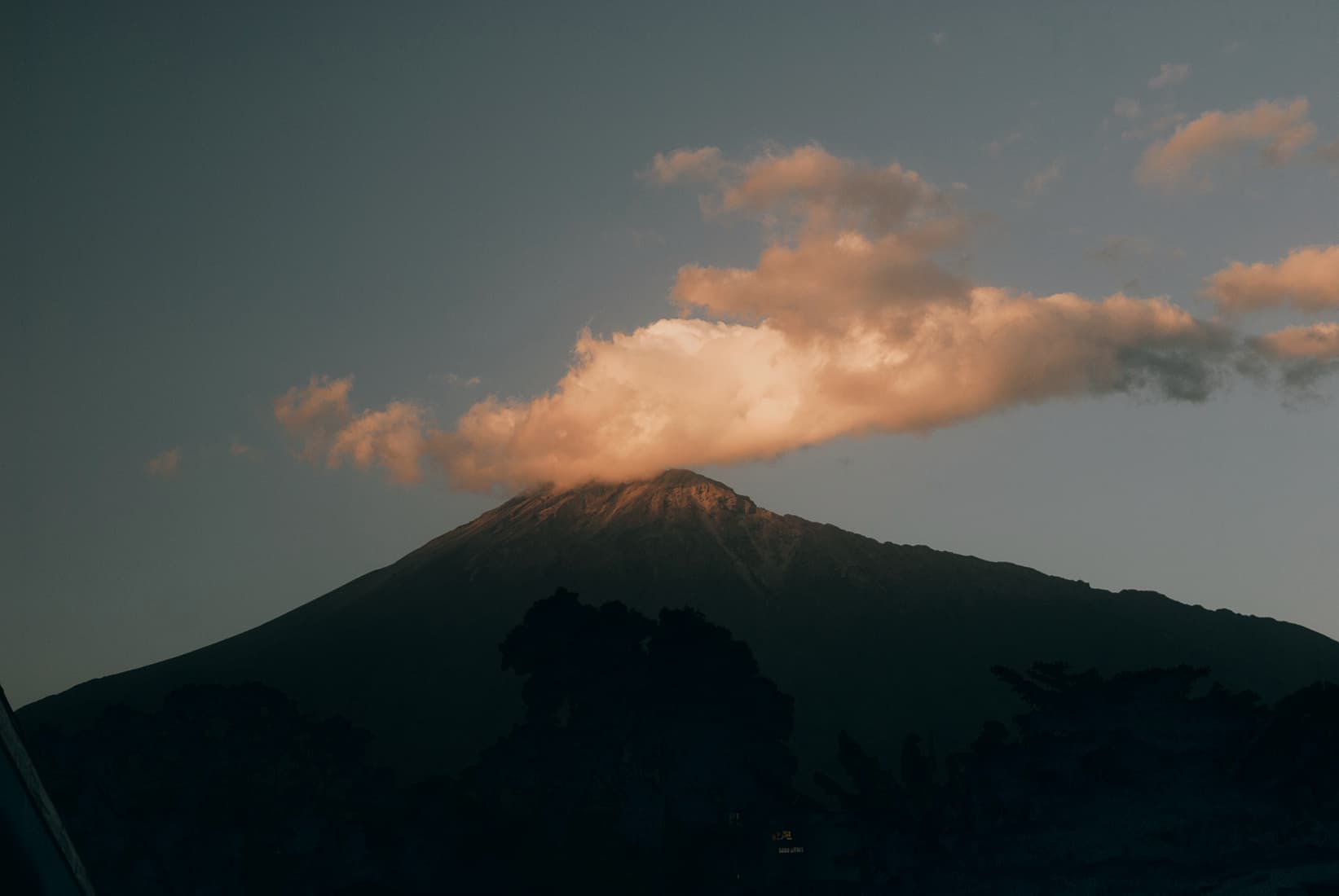
Color grade
Browse natural color grades from modern Kodak, Fuji, and Agfa negative film.
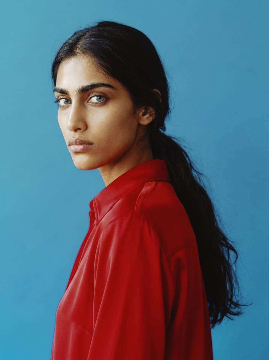
Ungraded reference portrait — no LUT applied.
The most saturated negative film Kodak makes. Ektar is built for landscapes: ultra-fine grain, vivid color, and contrast that sits just short of slide film. That same saturation pushes lighter skin red-orange, so it's the wrong call for portraits and Kodak says so. Use it for landscapes, travel, architecture, beaches, and big prints where color and sharpness matter most.
The quiet, refined Portra. 160 is the lowest-saturation, finest-grained of the line — warm natural skin, medium contrast, and no obvious color tint, which is exactly why it's so good for faces. It needs more light than the faster Portras and rewards it with clean, almost digital detail. Use it in good daylight for portraits, weddings, and anything where you want realism and smooth transitions over punch.
The most versatile color film made. Portra 400 is the do-everything stock: warm natural skin, low contrast, fine grain, and roughly twelve stops of forgiving latitude. It handles portraits, street, editorial, and documentary without complaint, and it loves a stop of overexposure. If you carry one color film, this is the one.
The fast Portra. The most saturated of the three, 800 keeps Portra's flattering skin tones while buying you speed for dim rooms, evening receptions, and slower medium-format lenses. Grainier than 160 and 400, but it holds together where they'd run short on light. The wedding-photographer safety net for when the sun goes down.
The film in everyone's family album. Gold 200 was Kodak's everyday stock for decades, and it shows in the rendering: warm yellows, honeyed skin, blue skies that lean slightly cyan. Nothing about it is subtle or neutral — it makes ordinary daylight look like a good memory. Use it for portraits, golden hour, and anything that should feel familiar rather than cinematic.
Gold's fast sibling, made for birthday parties and dim kitchens. The warmth stays, but grain steps forward and shadows get murkier — the look of a point-and-shoot flash photo from 1999. Strongest on indoor and night scenes, where the extra grit feels earned. Pairs well with a touch of Film Grain pushed into the shadows.

The drugstore workhorse. Ultramax was built to survive anything a disposable camera could do to it, so the look is punchy and forgiving: saturated reds, solid contrast, color that holds together in mixed light. Less romantic than Gold, more honest. The right call for street photography, snapshots, and anything that should feel candid instead of styled.
The studio and portrait stock. 160NS is green-biased Fuji color science with smooth gradients, clean skin across a wide tonal range, and a neutral gray balance built for controlled light. Punchier than you'd expect from a portrait film, with finer grain than its siblings. Use it for studio work, even daylight, and anything where you want skin to read natural and the greens to lean cool.

The wedding film. Those impossibly pastel greens and airy, painterly skin tones you've seen on a thousand bridal shoots — that's 400H overexposed by a stop or two. It tints cool where Kodak tints warm, shifting greens toward magenta and skin away from orange. Feed it light, meter for the skin, and use it when you want soft, light, and not too punchy.
The Fuji house look on a budget. Superia 200 is moderately saturated with intense reds and that signature blue-green shadow tint. Skin can go pink and reds go crimson if you underexpose, so this isn't a portrait film. Use it for everyday daylight, street, and anything with foliage or color you want to pop.
The everyday workhorse. Superia 400 brings deeper reds, neutral cool shadows, and that Fuji green-blue lean with a bit more pop than the 200. Some call it "Ektar light" — vivid, but less saturated and contrasty. The film for general use: travel, street, candids, anywhere you want one roll that handles most light.
The low-light Fuji. 800 sits between the balanced lower speeds and the grainy 1600, giving you handheld shutter speeds indoors and at dusk while keeping Fuji's vibrant, true-to-life greens. Colors flatten slightly compared to the slower stocks, but the speed earns it. Use it for indoor scenes, evening light, and anything moving where 400 runs out of room.
The fastest color film ever sold, and a low-light cult object. Natura was built for window light, night streets, and indoor scenes without a flash — situations slower films can't touch. Grain is there but unusually fine for the speed, greens render beautifully, and overexposing it slightly keeps the shadows clean. The honest choice for dusk, concerts, and parties where you'd otherwise reach for a flash.
The bright, cheap, cheerful one. Vista was the budget stock people stockpiled and mourned when it died, loved for a poppy warm palette over precision. Punchy contrast and saturated colors with no pretense of being neutral — closer to a snapshot than a portrait film. Reach for it when you want everyday color that looks happy rather than accurate.
The European warm stock. Optima was Agfa's fine-grained pro color, and in good light it leans into a soft, slightly unreal warmth — honeyed yellows and a low-autumn-light glow that flatters blues and greens. It wants a lot of light to show its best, and the grain is a touch heavier than the ISO suggests, which is part of the charm. Use it for daylight, architecture, and anything you want to feel like Western Europe in October.
Browse color grades inspired by early stocks, slide films, and analog cinema.
Ungraded reference portrait — no LUT applied.
Kodachrome rendered color like it had an opinion: deep reds, dense shadows, highlights that stay disciplined. Introduced in 1935 and developed through a process so complex only Kodak could run it, it became the slide film of record — sharp, saturated, and famously stable for decades. This is the balanced, all-era version. Use it when you want color that feels definitive rather than nostalgic.
Mid-century Kodachrome, straight from the family slide projector. Reds go richer, shadows drop toward black, and the whole frame takes on the dense, jewel-toned weight of postwar America documenting itself. It flatters strong, simple compositions — a red car, a striped awning, one face in good light. Underexpose slightly to deepen the mood.
The National Geographic decade. Kodachrome 25 and 64 gave the seventies its visual memory: warm but earthier than the fifties, with amber light, olive greens, and skin that glows without going orange. Paul Simon wasn't exaggerating about the nice bright colors. Made for travel, documentary, and sunlit portraits with a little dust in the air.
Where Technicolor shouted, Agfacolor spoke quietly. The German stock of the 1940s rendered the world in pastels — subdued reds, creamy highlights, a soft, almost painted calm. Decades later, surviving slides drifted further, adding gentle casts that became part of the look. Reach for it when you want color that feels remembered rather than recorded.
Postwar Agfacolor, the film of European holidays. Color confidence returns but keeps its manners: warmer skin, soft blues, contrast that never gets aggressive. It's the palette of seaside promenades and café terraces shot by someone's father. Works beautifully on architecture, travel scenes, and any frame that deserves a little optimism.
By the sixties Agfa had found its punch — this is the era of saturated reds and deep teal skies on slide film carried across Europe in glove compartments. Bolder than the 40s and 50s versions but still rounder and warmer than anything Kodak made. Try it on cars, signage, and strong primary colors; it was practically designed for them.
The first color photography most people ever saw. The Lumière brothers built Autochrome in 1907 from dyed grains of potato starch on glass, and the result looks like pointillism: grainy, luminous pastels with soft edges and a quiet, dreamlike haze. It turns modern sharpness into something handmade. Strongest on still lifes, gardens, and portraits with patient light — subjects an Autochrome could have actually held.
Hollywood's first working color, 1922. The two-strip process recorded only red and green — no blue layer at all — so skies turn seafoam, skin goes warm salmon, and everything sits in a strange, beautiful tension between the two. It's the look of silent-era spectacle. Use it when accuracy is beside the point and atmosphere is everything.
Start with film grain, then add halation around highlights and a film-inspired color grade like Film Classic or Vintage Film. Effect.app lets you stack these looks live, so you can tune texture, glow, and tone together.
Yes. Effect.app includes free browser-based film effects with no upload and no sign-up. Open the editor with Halation or explore Film Grain first.
Film grain comes from analog emulsion and scanning, so it has stock-specific texture and density. Digital noise is sensor artifacting; Film Grain recreates the organic texture people expect from film.
Yes. Effect.app runs in your browser and renders effects locally with WebGL. You can add Vintage Film, Black & White, grain, and halation without installing desktop software.
Use Halation on photos with bright lamps, neon, backlit edges, sunsets, or reflections. Lower threshold settings catch more highlights, while diffusion controls how wide the warm glow spreads.